
Charts that mislead
Cut-off axes, stretched scales, cherry-picked dates and pictures that grow in two directions: how a true number can be drawn to tell a false story.
BARS ARE READ BY LENGTH
A bar chart compares lengths, so it starts at zero
When you look at two bars, you compare how long they are. That only works if both bars grow from the same honest starting point, zero. Start the vertical axis somewhere else and you chop the same amount off every bar, which makes small differences look huge. This is called a truncated axis, and it's the most common chart trick in news and adverts.
Sales of 50 and 52 drawn from zero look almost equal. Drawn from 49, the bars become 1 and 3 units tall, and one looks three times the other.
Check yourself
Which kind of chart should almost always start its vertical axis at zero?
- A bar chart, because we compare the bars' lengths
- A line chart, because we compare the line's height
- Both, always, with no exceptions
- Neither; the axis should start wherever the data starts
Show the answer
A bar chart, because we compare the bars' lengths
Right. Bars are read by length, so cutting the axis distorts them. Line charts are read by slope and shape, so they can start above zero as long as the scale is clear.
Step through it
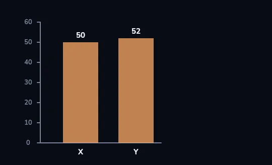
50 and 52, drawn from zero Two orange bars, X at 50 and Y at 52, on a vertical axis that runs from 0 to 60. Drawn honestly from zero, they look almost the same height, because they almost are.
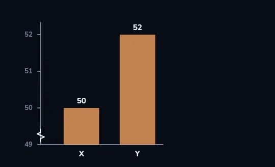
The axis now starts at 49 Same numbers, but the axis now runs only from 49 to 52, with a small zig-zag at the bottom marking the break. Everything below 49 has been cut off, so X is just 1 unit tall and Y is 3, and the two bars fill the whole frame.
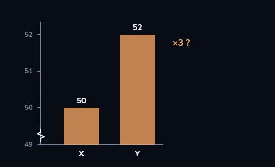
Y now looks three times bigger An orange "×3 ?" appears beside the tall bar. On this cut axis, Y looks three times bigger than X, and that's the story the eye takes away before anyone reads the numbers 50 and 52.
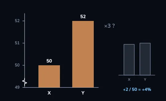
The real gap: about 4% The "×3 ?" fades to grey, and a small faint chart of the same bars drawn from zero appears on the right, the two bars nearly equal. Under it: +2 / 50 = +4%. The real difference is 2 out of 50, about 4%, so check where the axis starts before you trust a bar's height.
Check yourself
Two bars, 50 and 52, are drawn on an axis that starts at 49. Why does the second bar look three times taller?
- Because 52 really is about three times 50 once you account for growth
- Because the axis is cut off at 49, so the bars show only 1 and 3 units; the real gap is about 4%
- Because the chart uses a logarithmic scale
- Because the second bar was drawn wider
Show the answer
Because the axis is cut off at 49, so the bars show only 1 and 3 units; the real gap is about 4%
Right. Starting at 49 chops 49 units off both bars, leaving 1 and 3. The real difference is 2 out of 50, about 4%.
Line charts: same data, two stories
Stretched vertical axis
A price that went from 100 to 103 is drawn on an axis from 99 to 104.
The line shoots up like a cliff.
Squashed vertical axis
The same 100 to 103, drawn on an axis from 0 to 500.
The line barely moves: a ripple.
WHAT THE FRAME LEAVES OUT
Cherry-picked dates and dual axes
Cherry-picking a time window means choosing the start and end dates so the chart shows a rise or a fall that the longer history doesn't. Always ask what happened before the chart starts. A dual-axis chart puts two lines on two different vertical scales, one on the left and one on the right. By choosing those scales, the maker can make the lines cross, meet or split apart at will, so where they cross means nothing.
A chart of house prices starting at the bottom of a crash shows a steep "boom". Start it five years earlier and the same prices have only just recovered.
Check yourself
A chart shows total cases of an illness since January. The line only ever goes up. Which chart would better answer "is it getting worse?"
- The same total, drawn with a steeper scale
- New cases per week
- Total cases on a 3D chart
- Total cases since last January instead
Show the answer
New cases per week
Right. A cumulative total can only rise, even when things are improving. New cases per week (or per day) shows whether the pace is speeding up or slowing down.
Check yourself
A coin drawn twice as tall as another looks twice as big.
Show the answer
False
False. It's twice as tall and twice as wide, so it covers about four times the area, and it looks about four times as big. When a chart uses pictures, compare the numbers, not the pictures.
A reading routine for any chart
- Read the title and axis labels
What is being measured, and in what units? Missing or vague labels are a warning sign on their own.
- Check where the vertical axis starts
For bars it should be zero. For lines, notice how stretched or squashed the scale is.
- Counts or rates?
A bigger city has more of everything. Per person, or per 1,000 people, is usually the fairer comparison. And a cumulative total can only go up.
- Check the dates
What happened before the chart starts, and after it ends?
- Redraw it in your head
Ask what the same numbers would look like drawn the plain way.
Check yourself
- A chart of body temperature during a fever runs from 36 to 40 °C. Nobody complains that it doesn't start at zero.
- A bar chart of two companies' profits starts at 90 million. Critics say it's misleading.
Why is one axis that skips zero fine and the other not?
- Temperatures are scientific, profits are not
- A line of temperature is read by its changes, while bars are read by their full length
- Any chart about money must start at zero
- The fever chart has smaller numbers
Show the answer
A line of temperature is read by its changes, while bars are read by their full length
Exactly. Zero body temperature is meaningless for a person, and we read the fever line by how it rises and falls. A bar's whole length is the message, so cutting it off distorts the comparison.
Lesson recap
- Bars are read by length, so a bar chart should start at zero; 50 and 52 drawn from 49 look like a 3× gap instead of about 4%.
- Line charts can start above zero, but a stretched or squashed scale turns the same change into a cliff or a ripple.
- Cherry-picked dates and dual axes let a chart show a trend or a crossing the data doesn't support.
- Pictures grow in two directions: twice as tall means about four times the area.
- Read the labels, the starting point, the units and the dates before you trust the shape.