
The rule of thirds
Moving the subject off-centre is the quickest way to make a picture feel considered. Learn the grid, where to put horizons and eyes, how to leave room in front of a moving or looking subject, and when to break it.
THE GRID
Nine boxes and four strong points
Imagine two horizontal and two vertical lines splitting the frame into nine equal boxes. Putting your main subject on one of those lines, or better on one of the four crossings, usually feels livelier than dead centre, because the eye has somewhere to travel. You don't have to imagine it: turn on the grid. On a phone it's a switch in the camera settings, usually called Grid or Grid lines; on a camera it's in the display or viewfinder options. It's the single easiest composition habit there is.
Sara photographs a coffee cup on a café table. Centred, it looks like a menu photo. Moved so the cup sits on the lower-right crossing with the table edge running away from it, it starts to look like a moment.
Check yourself
Reza has just switched on the grid on his phone. Where are the strongest places to put his subject?
- Exactly in the middle box
- On the four points where the grid lines cross
- Right up against the edges of the frame
- In the four corners
Show the answer
On the four points where the grid lines cross
Right. The four crossings are the classic strong points. A subject there feels placed on purpose, and the rest of the frame gives the eye room to move.
HORIZONS AND EYES
Put the horizon on a third, not through the middle
The horizon is a line too, so it goes on a grid line. Put it on the lower third when the sky is the interesting part, a sunset or dramatic clouds, and on the upper third when the land or water is: a beach, a field of flowers, a lake with ripples. Cutting the frame exactly in half tends to feel undecided, unless you want perfect symmetry such as a reflection. Keep it level: many phones show a small level line when the grid is on. In a close portrait, the same idea puts the eyes roughly on the upper third line.
A beach at sunset with a plain grey sea: horizon low, so two-thirds of the frame is orange sky. The same beach at noon with bright turquoise water and pale sky: horizon high, so the water gets the space.
Check yourself
Mina is on a rooftop. The sunset sky is spectacular, and the only thing below the horizon is a plain car park. Where should the horizon go?
- Exactly across the middle, to keep things balanced
- On the upper third line
- On the lower third line
- It doesn't matter as long as the sun is in the frame
Show the answer
On the lower third line
Right. The sky is the interesting part, so the horizon goes low and the sky gets two-thirds of the frame. The car park shrinks to a thin strip.
Step through it
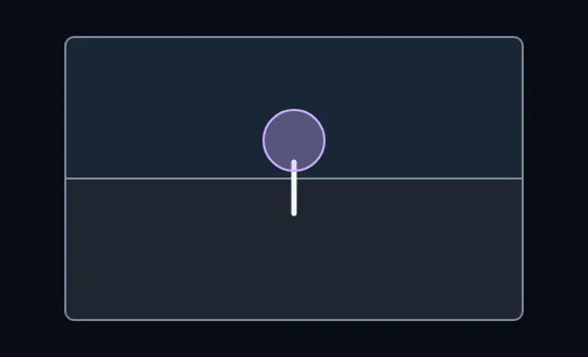
Tree in the middle, horizon through the middle A lone tree in a field: the horizon cuts the frame exactly in half and the tree stands dead centre. It's tidy, but static: the eye lands in the middle and has nowhere else to go.
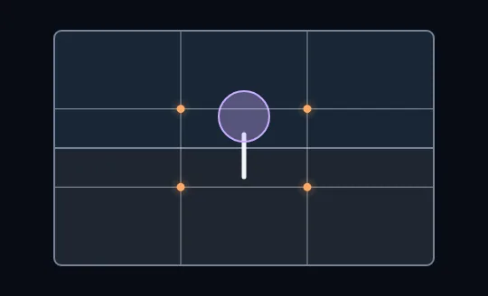
The grid appears: nine boxes, four crossings Two horizontal and two vertical lines now divide the frame into nine equal boxes. The four orange dots where they cross are the strong places for a subject. The tree and the horizon haven't moved yet, still sitting in the middle.
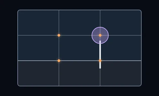
Horizon down to the lower third, tree onto a crossing The horizon slides down onto the lower grid line, so the sky now fills two-thirds of the frame. The tree moves to the right-hand line with its round crown sitting on the upper-right crossing. Same tree, same field, but the picture now has room to breathe and a place for the eye to travel.
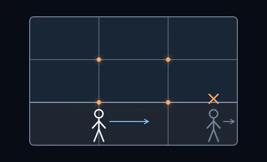
Leave room in front, not behind The tree fades and the grid stays. A walker stands on the left-hand line facing right, with a blue arrow pointing into the open space ahead. The dim copy squeezed against the right edge and facing out of the frame is crossed out: leave space in front of a subject that is moving or looking, not behind it.
Check yourself
In the last frame, why is the dim figure at the right edge crossed out?
- It's too small to see clearly
- It isn't on a grid line
- It faces out of the frame with no space in front of it, so the picture feels cramped
- Figures should always be in the centre
Show the answer
It faces out of the frame with no space in front of it, so the picture feels cramped
Right. It's heading straight out of the picture with all the empty space behind it. The eye follows its direction and falls off the edge.
Lead room
The empty space you leave in front of a subject that is moving or looking somewhere, also called looking room or nose room. More space ahead than behind feels natural, because the viewer's eye follows the direction the subject is going or facing.
A cyclist riding left to right goes on the left third, with the open road ahead of her on the right. Someone gazing out of a window goes on the side away from the window's view, so their gaze has somewhere to land.
Thirds or centre?
Use the thirds
Most everyday scenes: landscapes, a person in a place, anything moving or looking to one side, street scenes. Off-centre placement plus lead room gives the picture direction and room.
Centre it on purpose
Strong symmetry: a reflection in still water, a doorway or bridge seen straight on, a face looking straight into the lens, or a very simple minimalist shot. Here the middle is the point, so go all the way and make it exact.
Check yourself
Nima is out with his phone. For each shot, would you use the thirds or centre it?
- A mountain perfectly reflected in a still lake
- A cyclist riding across the frame
- An old wooden door, shot straight on
- A lone tree in a wide field
- A friend looking out to sea
- A face looking straight into the lens
Show the answer
Thirds: A cyclist riding across the frame, A lone tree in a wide field, A friend looking out to sea
Centre: A mountain perfectly reflected in a still lake, An old wooden door, shot straight on, A face looking straight into the lens
What to do next time
- Turn on the grid once and leave it on.
- Put the subject on a line or a crossing, not in the middle box.
- Horizon on the lower third for sky, the upper third for land or water, and keep it level.
- Leave lead room in front of anything moving or looking.
- Centre on purpose when the scene is symmetrical.
Check yourself
- Sara photographs a runner in the park. The runner is on the left third line, heading right, with the empty path ahead of him. The shot feels full of movement.
- A minute later she takes the same runner at the same size, but now he's at the right edge, still heading right, with the empty path behind him. The shot feels cramped, as if he's about to leave.
What makes the difference between the two shots?
- The second shot has less light
- In the first, the space is in front of the runner; in the second, it's behind him
- The runner is further away in the second shot
- The first shot uses a longer lens
Show the answer
In the first, the space is in front of the runner; in the second, it's behind him
Exactly. Same runner, same size, same direction. Only the lead room changed: space ahead gives him somewhere to go, space behind makes him look like he's running out of the picture.
Lesson recap
- Two lines each way split the frame into nine boxes; the four crossings are strong places for a subject.
- Turn on the grid in your phone or camera settings and leave it on.
- Horizon on the lower third to feature the sky, the upper third to feature land or water, and keep it level.
- Leave lead room in front of a subject that is moving or looking, not behind it.
- Centre on purpose for strong symmetry, and get closer before you think about any of it.